From Aqua to Catalina: The evolution of the Mac OS X operating system
[ad_1]
Mac OS X has been through a lot in 20-plus years. As someone who was sitting in the front row at Macworld Expo when then-CEO Gil Amelio brought Steve Jobs on stage to celebrate Apple’s purchase of NeXT, it feels like I’ve been a witness to the whole story.
The macOS we use today is the result of iteration—sometimes rapid, sometimes painfully slow—over 16 major OS releases during those 20 years. Here are the highlights.
Before there was Mac OS X, there was Rhapsody
Before it was Mac OS X, the next-generation Mac OS was code-named Rhapsody. Software written for NextStep—what would become Cocoa—ran natively. Classic Mac OS apps ran in a compatibility window. Rhapsody aped Mac OS 8 in its design language, but that design would be thrown away before OS X finally shipped.
Most importantly, major Mac software developers were not willing to rewrite their apps for the “Yellow Box” of NextStep. Apple had to go back to the drawing board and come up with a more robust transition approach for developers, which led to the “Blue Box” that offered the ability to adapt classic Mac apps to run natively on the new operating system.
In 1999, Apple released Mac OS X Server 1.0, which was a weird fusion of NextStep and Mac OS, with interface quirks never seen before or since. It sort of looked like Mac OS, but if you used it for a minute you’d realize it was more liked a re-skinned version of NextStep.
After a developer preview version, Mac OS X Public Beta (internally it had the code name Kodiak) arrived in 2000, and while it was technically a beta version, Apple still charged $30 for the privilege of testing it. It still looked a lot like Mac OS 8 and had no Apple menu, but it did have a nonfunctional Apple logo parked dead center in the Mac menu bar. In his review for Ars Technica, John Siracusa wrote, “The Macintosh is defined by its interface, and any redefinition of that must be at least as good as what it’s replacing. Mac OS X Public Beta does not reach that goal.”
OS X early days
In March 2001, Mac OS X 10.0 (internal code name Cheetah) was released. It was… not great. The new Aqua interface, which Steve Jobs had unveiled to quite a bit of fanfare, was pretty, full of translucency and trendy 3-D effects. The core of Mac OS X was there, offering plenty for Apple and third-party developers to build on.
But that original version was terribly slow. Rebooting a Mac into Mac OS X—and in those days, nobody in their right mind was deleting their classic Mac OS partition and committing full time to OS X—would result in a perfectly speedy Mac feeling like it was dipped in molasses.
Apple knew it, and moved quickly to rectify the situation. Mac OS X 10.1 (internal code name Puma) was the first version that felt like it was actually ready for day-to-day work. On Macs with G4 processors, it was actually faster than Mac OS 9, which was quite a thing to see. It added back support for AppleTalk and AFP servers, which was a huge boost to compatibility in existing networks. And version 10.1 was the first version to run the new Microsoft Office X, a huge milestone in the acceptance of Mac OS X as a valid platform. In my Macworld review of OS X 10.1, I wrote, “This version combines much of OS 9’s functionality with a collection of improvements that make upgrading to OS X a serious possibility for even dyed-in-the-wool devotees of the classic Mac OS.”
Released in August 2002, Mac OS X 10.2 was the first version of Mac OS X to be generally referred to publicly by a “big cat” nickname—it was Jaguar. Jaguar saw Apple tone down some of the biggest design missteps of the Aqua interface, reducing transparency effects. In my Macworld review, I wrote, “Drop-down menus, while still slightly transparent, are much more opaque, making them more readable. A pop-up menu in the General preference pane lists four anti-aliasing algorithms, so you can choose the method of smoothing text that best fits your monitor and, even more important, that is easiest on your eyes.”
Cruise control
Jaguar was probably the first version of Mac OS X that classic Mac OS holdouts adopted. It ended the era of Mac OS X’s most rapid development. After Jaguar, Apple’s OS X releases were a little more refined and focused, with one or two major feature additions and a raft of smaller tweaks. It was the beginning of a long cruise with what was now not just a Mac OS, but the Mac OS.
Mac OS X 10.3 Panther: Arrived in the fall of 2003, Panther integrated Apple-branded cloud storage support for the first time, via iDisk. The Finder added a sidebar, which is a handy place to store familiar folders to this day, and colored labels for files. Open and Save dialog boxes also picked up the sidebar and let users display them as icons or a list, rather than using the multi-column, NeXT-style browser that was the only option in previous versions. Read my Macworld review of Panther.
Mac OS X 10.4 Tiger: Appeared in the spring of 2005. Its banner feature was Spotlight, which—then as now—gave users a personal search engine for the files on their Mac for the first time. Automator also made its debut with Tiger, in the hope of bringing the joy of automation to users who were too overwhelmed by the idea of writing AppleScript scripts. Dashboard, a layer of JavaScript-based “widgets” full of glanceable information, also made its first appearance. In my Macworld editor’s column about Tiger, I wrote, “It’s hard to tell whether [Tiger’s} changes are for the good or not—all you know is that they’re different. But then, slowly, you begin to form judgments about the new features, to appreciate small touches that originally escaped your notice.”

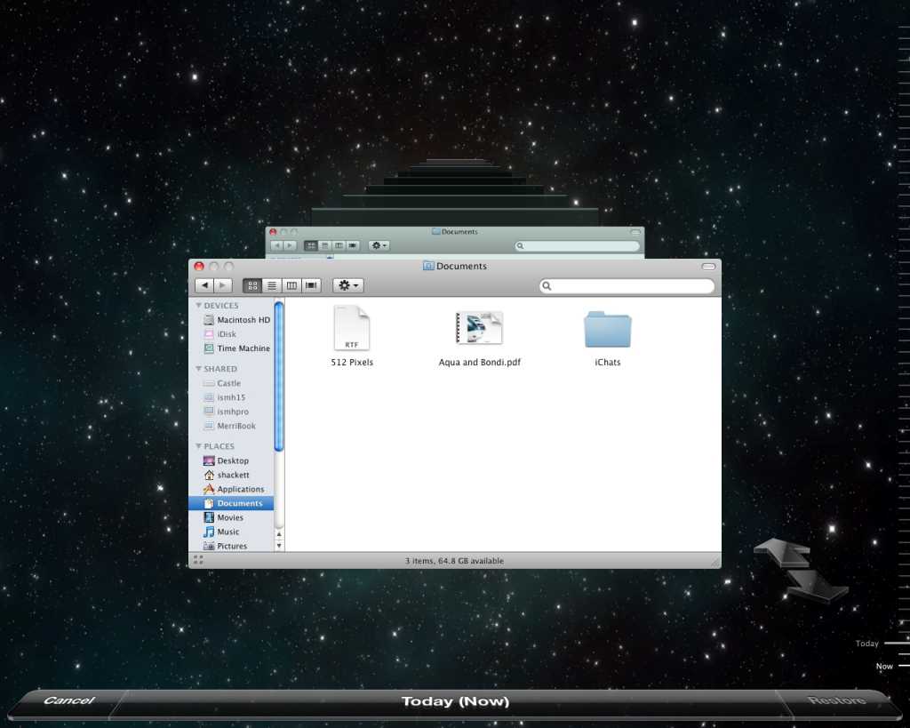
Time Machine made its debut in Mac OS X 10.5 Leopard.
Mac OS X 10.5 Leopard: Released in the fall of 2007. Apple highlighted the fact that it added 300 new features to OS X, including a simplified user interface (good!) and a semitransparent menu bar (bad!). The big new feature in Leopard was Time Machine, letting Mac users back up their computers by plugging in an external hard drive. Apple also introduced Spaces, which riffed on the existing Exposé feature to allow users to switch between multiple workspaces. And if you’ve ever pressed the space bar in Finder to preview a file, you’ve got Leopard to thank—it introduced Quick Look. In my Macworld review, I wrote, “Quick Look itself is an impressive technology, if longtime users can retrain themselves to press space rather than double-clicking on a document to see what’s inside.”
Mac OS X 10.6 Snow Leopard: Released in the summer of 2009. This was famously the “bug fix” edition of OS X, in which Apple focused on improving stability, boosting performance, reclaiming disk space, and adding support for 64-bit processors. Nothing says that your operating system has reached a comfortable, stable point than a bug-fix release. In my Macworld review, I said that Snow Leopard was a “no-brainer of an upgrade.”
Middle age creeps in
OS X 10.7 Lion: For all the comfort that Snow Leopard gave us, 2011’s Lion brought the pain—in my Macworld review, I said that Lion was “a shock to the system.” Lion broke a lot of software that had worked for years in OS X, including many apps that I used to record podcasts. It took years for replacements to emerge. Lion introduced “natural scrolling” and trackpad gestures, new auto-hiding scroll bars, full-screen apps, the iOS-style app launcher Launchpad, a very confusing new paradigm for auto-saving and versioning, and AirDrop for quick wireless file exchange between Macs.
OS X 10.8 Mountain Lion: A surprise summer 2012 release—people didn’t expect a new Mac OS release only a year after the previous one, when Apple seemed to have settled into a once-every-two-years pace. In my Macworld review of Mountain Lion, I thought that the new release schedule was a sign of “more careful incremental updates (with fewer bugs) rather than great leaps (with more, nastier bugs).” Mountain Lion deeply integrated iCloud into OS X for the first time. Stalwart OS X apps—Address Book, iCal, and iChat—were renamed to match their iOS equivalents (Contacts, Calendar, and Messages). Reminders, Notes, and Game Center also made the move from iOS to OS X.

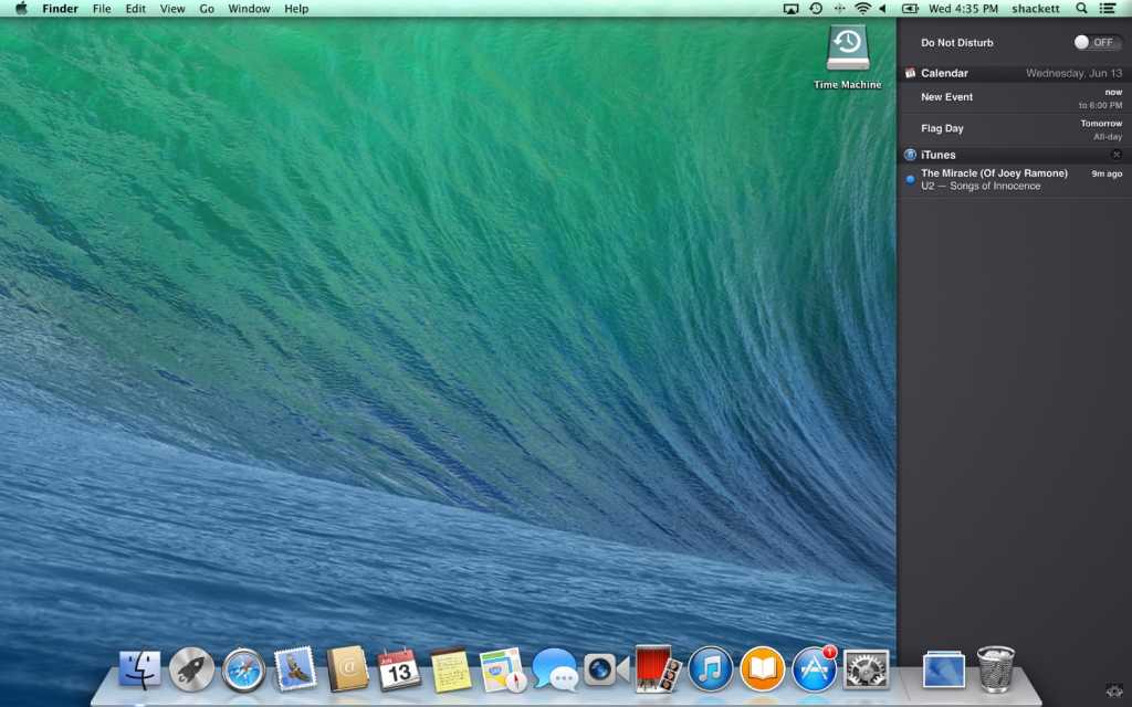
OS X 10.9 Mavericks: Arrived in the fall of 2013, ending the era of big cat names and putting Mac OS X on an annual release cycle that it continues to this day. Owing to changes in Apple’s business model and various financial regulations, Mavericks was the first release of OS X since version 10.1 to be given away for free. In my Macworld review of Mavericks, I called it a “grab bag of tweaks, simplifications, advances made in lockstep with iOS, and improvements under the hood.” Mavericks added tabs and tags to the Finder, Reading List to Safari, iCloud Keychain for storing passwords, an iOS-style Notification Center, and AirPlay mirroring.
OS X 10.10 Yosemite: In the fall of 2014, Yosemite proved that Apple wasn’t going to move OS X to version 11.0 without a fight. Yosemite doubled down on iCloud Drive support, added Continuity and Handoff for more integration with other Apple devices, and upgraded AirDrop to work with iPhones and iPads. In my Macworld review, I pointed out that Yosemite sets up the Mac operating system for a future with Retina displays.
OS X 10.11 El Capitan: Released in 2015. It introduced pinned sites in Safari, more expansive Spotlight searches, and upgrades to Mission Control including a new Split View. In my Macworld review of El Capitan, I found that a few apps I relied on weren’t initially compatible with El Capitan, though new app versions eventually came.
macOS 10.12 Sierra: In 2016, OS X became macOS. Sierra added Siri to the Mac. In Roman Loyola’s Macworld review, he wrote that Siri initially felt “like a luxury than a must-have,” but found Siri useful for tedious tasks. Sierra also introduced Apple Watch unlock and Apple Pay, and allowed the automatic syncing of your Desktop and Documents folders to iCloud Drive.
macOS 10.13 High Sierra: Like Snow Leopard, it was a mostly under-the-hood update, released in 2017. It laid the groundwork for the future by introducing the new APFS filesystem and Metal 2 graphics framework. It was a pretty boring update, but sometimes boring is good. Roman Loyola’s Macworld review of High Sierra said that it, “lay[s] a foundation for better things to come.”
macOS 10.14 Mojave: Introduced in 2018, it featured Dark Mode, new color accents, and a subtler interface more suited to Retina displays. More dramatically, four iOS apps—News, Stocks, Voice Memos, and Home—were brought over to the Mac directly from iOS via an early version of Apple’s Mac Catalyst technology. Here’s Roman Loyola’s Macworld review.
The start of something new
But change was in the air for macOS and the Mac in general. Something was on the horizon—the coming of Macs running Apple silicon.
The precursor to the big changes on the Mac was macOS 10.15 Catalina, released in the fall of 2019. It ended support for 32-bit apps, breaking compatibility with a lot of software we’d been using for years, if not decades. Mac Catalyst also appeared, allowing developers to bring their iPad apps to the Mac with only minor tweaks. iTunes became Music, and new TV, Podcast, and Find My apps arrived on the scene (via Mac Catalyst).
Which brings us to 2020 and the end of the old 10.x numbering system. macOS 11 Big Sur marks a new era for macOS, with a redesigned interface that brings to mind some of the excesses of the early days. A new Control Center arrived in the menu bar, and Mac Catalyst got a bunch of improvements. But the biggest feature of Big Sur is support for processors built by Apple—and Macs running those processors can even run iOS App Store apps unmodified.
20 years on, macOS doesn’t feel like it’s about to lay down and die. Instead, it feels reinvigorated, as Apple charts a new course into an Apple silicon-based future. Here’s to many macOS versions to come.
[ad_2]
Source link


