The worst Apple products of all time
[ad_1]
It’s been 45 years since Apple became a company, and it has released a lot of groundbreaking products over that time. But it hasn’t all been iPhones and iPads—Apple has also made more than its fair share of failed, clunky, and just plain terrible products. Narrowing down our list was surprisingly tough, so we focused on products that had a combination of bad and impactful—nobody cares that the Pippin was terrible. With that in mind, here are our picks for the 10 worst Apple products of all time (in no particular order), and be sure to check out the best Apple products over at Macworld UK.
Apple USB Mouse (Hockey puck mouse)
Apple
Officially called the Apple USB Mouse, this was the first Apple mouse to drop Apple Desktop Bus (ADB) in favor of USB. That’s about all it had going for it. Apple’s first USB mouse shipped with the original Bondi Blue iMac G3 and was easily the worst part of that computer. The circular shape was such a catastrophic disaster of design that it now sits proudly near the top of any list of Apple failures you’ll ever come across. It was uncomfortable to hold, rotated as you used it, and tipped when you clicked the button too hard. Oh, and the cord was way too short. It’s not a good sign when the thing you are meant to use as the primary means of controlling a product is largely unusable (see: Siri Remote below).
—Jason Cross
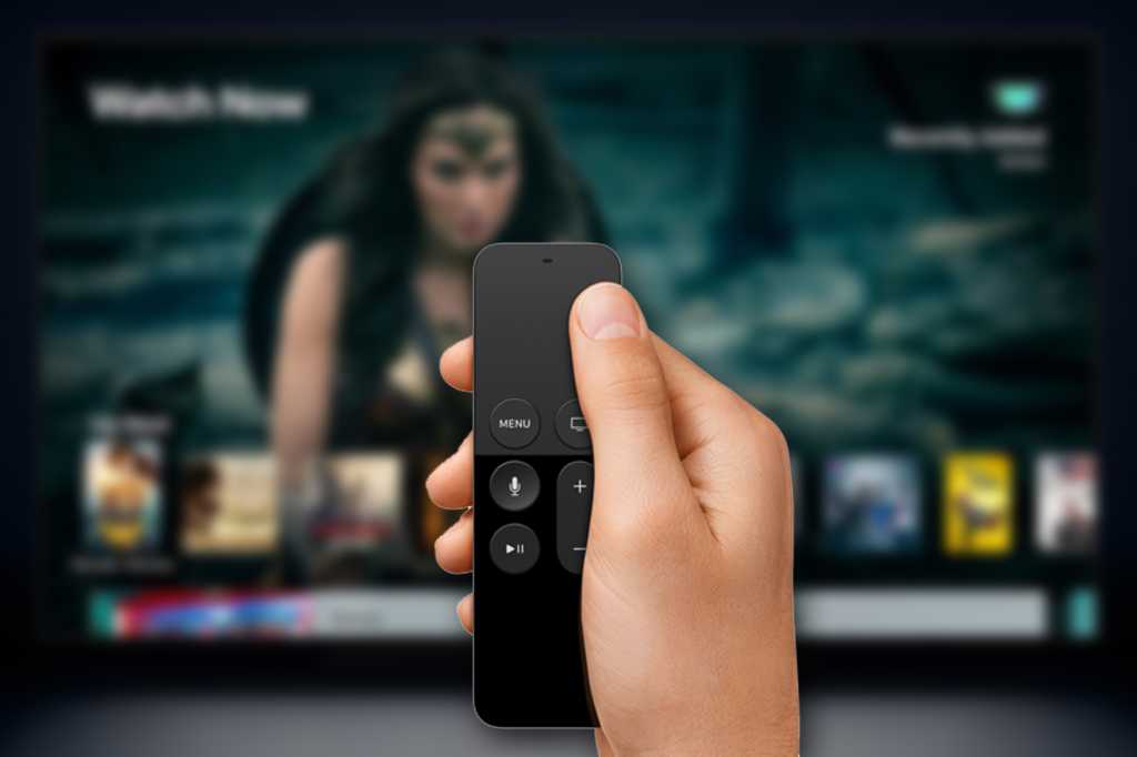
Siri Remote
Apple
Apple is often accused of pursuing form over function, and when it makes devices like the Siri Remote you can see why. The average TV remote is big and dumb and ugly, but it does its job well: it feels comfortable in the hand and helps you find buttons without looking. Apple created a remote that was slim and minimalist, with the result that you don’t even know if you’re holding it the right way up. The trackpad is cooler than the old direction wheel but less user-friendly. And the remote gets lost all the time, just to add insult to injury. We’ll be happy to see it go (hopefully) with the next Apple TV update.
—David Price
eWorld/.Mac/MobileMe

IDG
Before there was the internet, there were dial-up online communities, with America Online being the most popular. In 1994, Apple tried to get in on the action with eWorld, which also replaced the outdated AppleLink online support service. But not only did it have to battle AOL, it was available only to Mac and Newton users, and it didn’t offer anything of value that wasn’t on AOL. Combine that with Apple hardly putting any effort into eWorld at all, and it was an easy project to put on the company’s chopping block during its massive restructuring in 1996.
—Roman Loyola
Apple’s online services offerings have had a bit of a rocky history and those with a coveted @mac.com email address probably don’t have the happiest memories. That email address initially came with iTools, but was later part of the subscription-based .Mac offering that included web hosting, online storage, and backup abilities. In June 2008, Apple gave subscribers to .Mac exactly one month’s notice that they would be closing .Mac and replacing it with MobileMe. The transition was anything but smooth with issues delaying the start of MobileMe, but worst of all, many of the .Mac features were not transitioned (I’ve never really forgiven Apple for the lost libraries of photos I had stored on the service). Thankfully Apple let us keep the @mac.com address because that’s the only good thing to come out of it.
—Karen Haslam
The final rebranding of Apple’s pre-iCloud online service (after iTools and .Mac), MobileMe at least had the right idea. For $99 per year, Apple would sync all sorts of stuff across your gadgets: photos, contacts, e-mail, bookmarks, and so on. It was pitched as “Exchange for the rest of us.” If only it actually worked! The service was plagued with problems from the very beginning, including launch delays, sign-up failures, and multiple serious outages. Things were so bad that Apple gave out two free extensions. Steve Jobs even wrote a company-wide email in which he said, “The launch of MobileMe was not our finest hour.” Ouch.
—Jason Cross
iPod Hi-Fi

Roman Loyola/IDG
Apple marketed the iPod Hi-Fi bookshelf speaker as a revolution in home audio for enthusiasts, but the message fell on deaf ears. It didn’t help that the iPod Hi-Fi didn’t produce the sound quality that nit-picky audiophiles demanded and its design actually hampered stereo imaging. It was built to be portable but it was quite heavy at 17 pounds and it absolutely wasn’t built to take the abuse that comes with being carried around. While we’ll admit it had a solid design, the iPod Hi-Fi just couldn’t compete with its more practical and better-sounding challengers and was discontinued just a year after its release.
—Roman Loyola
Butterfly keyboard

IDG
In 2015, Apple made the best laptop keyboard on the planet. After the MacBook landed in March, it also made the worst. The MacBook’s butterfly keyboard was supposed to be a revolution in thinness that delivered “a crisp and responsive feel when typing.” Instead, it was loud, sticky, and prone to so many issues that Apple launched a service program that covers every butterfly keyboard model ever released. Thankfully Apple has since returned to delightful scissor-switch keys, but we’ll never forget the five long years we suffered with the butterfly keyboard.
—Michael Simon
Apple Maps launch

IDG
Almost a decade ago, Apple sought to end its reliance on Google Maps with its own mapping service and app. First shipped in iOS 6, Apple Maps was a cobbled-together mashup of various data sources that were all out of the company’s direct control. The results were often pretty, but that’s about all. It was fraught with data errors such as warping landscapes, inaccurate labels, and directions that were so bad they became the subject of internet memes. It took several years for Apple to clean up the mess, all while Google kept adding features to its own mapping service. Two years ago Apple began rolling out all-new map data—gathered and controlled by Apple—and Apple Maps is finally starting to get legitimately good. But those first few years were terrible and unforgettable.
—Jason Cross
AirPods Max Smart Case

Apple
You can argue about the merits of the AirPods Max themselves, which have proved divisive (I like them). But pretty much everyone agrees that their case—hilariously branded as the Smart Case—is a stellar example of Apple’s bad design. It looks like nothing you’ve seen in your life: a weird hybrid blend of handbag and failed art project. Quality control is lacking, with cutouts in slightly the wrong place and magnets weaker than they should be. And most importantly it provides no protection whatsoever to the most vulnerable part of the AirPods Max, their headband. Smart Case? More like Dumb Case.
—David Price
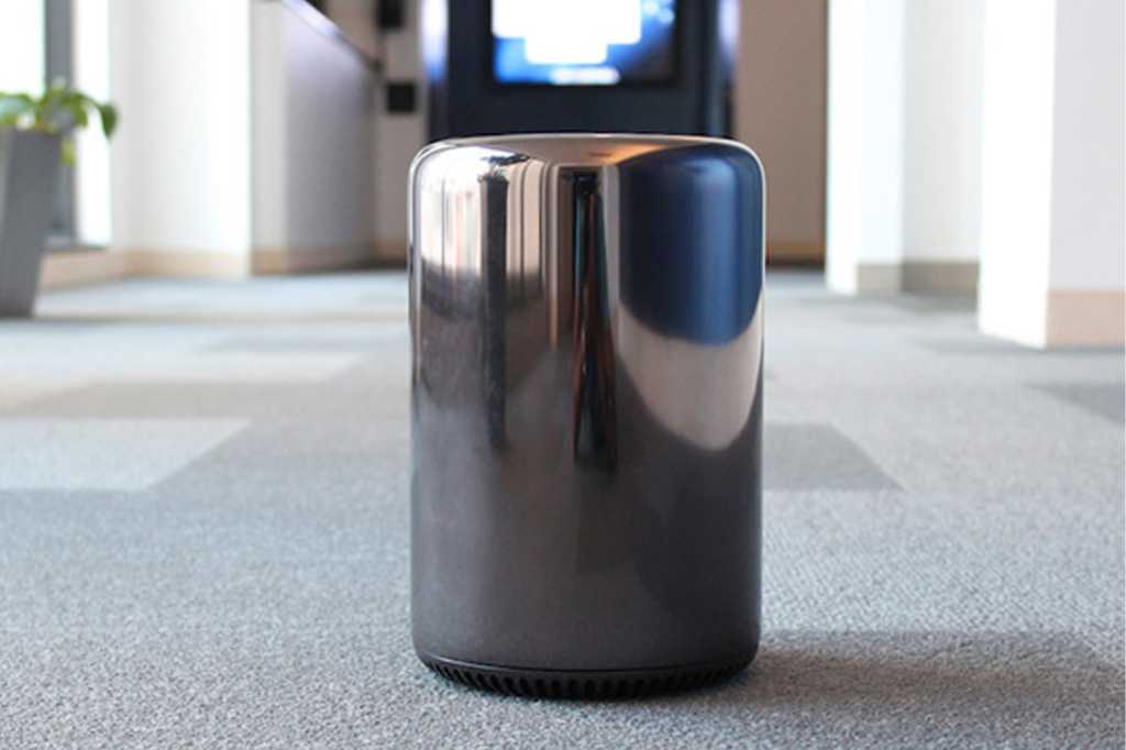
Mac Pro (2013)
IDG
Apple’s sleek, modern, and compact designs are part of its corporate identity, but the 2013 Mac Pro is an example of the company trying way too hard. When Apple replaced the towering Power Mac/Mac Pro behemoth with a cylinder a fraction of the size, it was a prime example of a company thinking it can get away with telling its customers what they need instead of listening to those customers. The 2013 Mac Pro was an engineering feat, but Apple eventually acknowledged that it did its customers wrong and went back to a tower design for the Mac Pro in 2019.
—Roman Loyola
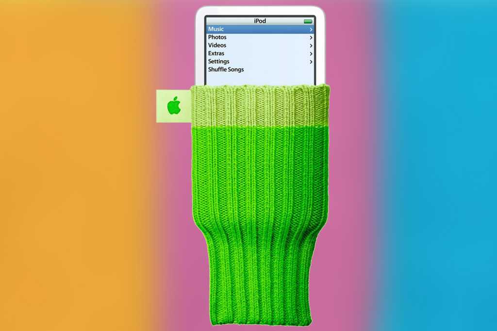
iPod Socks
IDG
It was hard to know whether Apple was entirely serious when it started selling iPod Socks in December 2004. The iPod Socks fit any iPod or device of that particular size and shape, cost $29, and were sold in packs of six in a variety of bold colors. Apple was no doubt hoping to get them into Santa’s sack, but the iPod Socks were tacky— the polar opposite of what we expect from Apple. Beyond shielding iPods from scratches and dust, there was little benefit to the iPod Socks. They would certainly offer no protection if you dropped your iPod. And yet, as implausible as it may seem, the iPod Socks continued to be sold by Apple until 2012 when they were finally removed from shelves.
—Karen Haslam
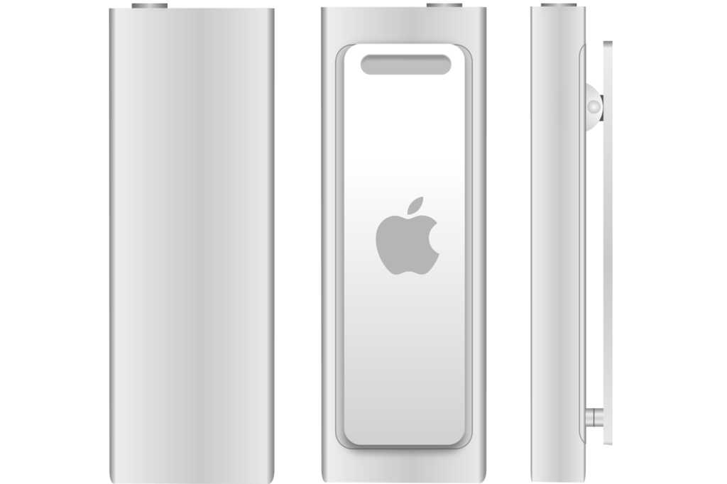
iPod shuffle (3rd gen)
Apple
The original iPod Shuffle basically got everything right. The third-gen model did not. It was cheaper at just $59 and came in a variety of colors, but the good stuff ended there. Apple took the “shuffle” part to heart and removed all buttons from the face of the device. It moved all of the controls to the headphone cord, which meant you had to use Apple’s earbuds or buy a third-party pair with an Apple-approved headphone adapter if you wanted buttons, or else rely on voice control, neither of which were ideal solutions. Plus its incredibly small size made it very easy to misplace despite its built-in clip. “Easy to lose and hard to use” isn’t nearly as compelling as “1,000 songs in your pocket.”
—Michael Simon
[ad_2]
Source link


