iOS 15 wishlist: 10 ways Apple can make our iPhones better
[ad_1]
Last year’s iOS 14 release was one of the best iPhone updates yet. Apple didn’t necessarily deliver everything on our wishlist from last spring, but it made big strides on a surprising number of them.
Looking forward to iOS 15, we still want Apple to tackle some of our evergreen complaints (Siri), but the addition of big changes like the App Library and home screen Widgets have gone a long way toward making iOS a more modern and flexible mobile operating system. But we’d like Apple to go even further. Here are some of our most-desired features and changes for this year’s major iPhone OS update. And be sure to check out our wishlists for macOS 12, iPadOS 15, and watchOS 7 coming soon.
Appearance
Lock screen
Along with a pair of shortcuts that you can’t customize, the iPhone lock screen doesn’t do much other than display the time and date, and the battery level (briefly). Its primary purpose is to show notifications as they arrive, but the lock screen really isn’t the best place for that—they should flash up when new, but seeing old notifications on the lock screen doesn’t have a lot of utility that wouldn’t be served just as well by swiping down to show the notification shade.
Far better would be to allow us to put widgets on the lock screen. If there’s a security concern with showing data on an unlocked phone (though Face ID should be able to take care of it as it does with notifications), another alternative might be for Siri to be proactive and show what it feels might be useful information based on our use habits. If you have a calendar event coming up soon, it may appear, but not if it’s more than an hour away. If you always call your mom on Saturday at 3 pm, a “Call mom” button could be present near that time. The current weather and near-term forecast might always be visible. Tapping on any of these things would unlock your iPhone (with Face ID) and take you directly to the related app.
The current time-date-and-list-of-notifications lock screen doesn’t do a very good job of what a modern lock screen should aspire to—intuitively helping you get directly to the thing you were picking up your iPhone to do—and helping you keep it locked for longer.
Always-on display
The Apple Watch has an always-on display. OLED Android phones have had always-on displays for years. There’s no reason why the OLED iPhone models can’t have them as well. An always-on “sleep” screen for the iPhone should be similar to the lock screen, with a few adjustments. It should display time, date, and battery life on a black background, but no notifications. Perhaps new notifications could briefly appear and go away, but we need fewer reasons to pick up our phone, not more.
An always-on display would do wonders for the iPhone.
EverythingApplePro
I’d love to see Apple take the idea of complications from the Apple Watch and add them to the lock screen and always-on sleep screen. Perhaps four of them, flanking the clock, with standardized formats. Developers could produce complications for their apps, and users could choose which four they want to see. This would be a great way to get simple information without picking up our phones and diving into apps. Some of what we need we could get without even unlocking our phones. It would make the iPhone more useful even when at rest while providing an important feature to promote digital health and wellbeing.
App Library
The App Library was one of the biggest and best new features of iOS 14. A place where all your apps live, allowing you to remove seldom-used apps from your Home screen—it’s Apple’s answer to the App Drawer that Android users have had forever.
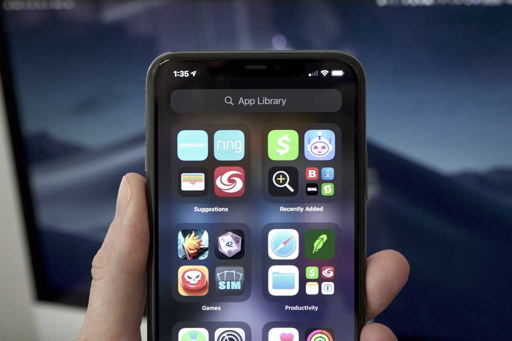
While the concept is great, the implementation leaves a bit to be desired. The automatic app groupings are confusing—it’s unclear which apps are in which group if you can’t see the icon, and it’s hard to understand that tapping on the larger icons in each group opens that app but tapping on the little group of four icons in the lower-right opens up the group to explore. The auto-arrangement of groups is frustrating, too—core interface features should not be rearranged every time you visit them, or you’ll never develop a familiarity with where you need to go to do things.
IDG
Apple can change each App Library group to show four large icons, and make the group open when you tap anywhere on it (rather than launching the app directly). The group arrangement should be static and editable (via the usual tap-and-hold “jiggle mode”). And we should have an option in Settings to make the App Library default to the list view, instead of having to drag down on the App Library screen or tap the search bar at its top.
Apps
Weather
The Weather app is stuck in the past, having changed very little since the redesign back in iOS 7. It’s time to completely overhaul its visuals, and move on from the Weather Channel as a data source. Why else did Apple buy Dark Sky?

Apple
Weather is one of those things where everyone has different priorities, so the new Weather app should focus on adaptability and customization options in addition to bringing the interface up to modern standards. We’d like to see live radar, more information, an actual seven-day forecast, and weather-service alerts, not to mention a design that doesn’t look like it was designed three years ago.
Home
While we’re talking about apps in need of an overhaul, the Home app feels like Apple just doesn’t care about HomeKit stuff at all. A basic grid of squares with minimal info, with no direct feedback about what happens when you tap on one versus long-press? Lights adjusted individually instead of in groups?
Home needs bigger “widgets” for different HomeKit-enabled devices that show more information about their current state and have smarter integrated controls. HomePod needs its own tab to display recent queries and the results of Siri questions that need visual aid. The whole app needs a ground-up change in design philosophy, one that makes it seem like smart home technology is actually important to Apple. The current Home app has a very “minimum viable product” feel, and it’s not a good look.
Stocks
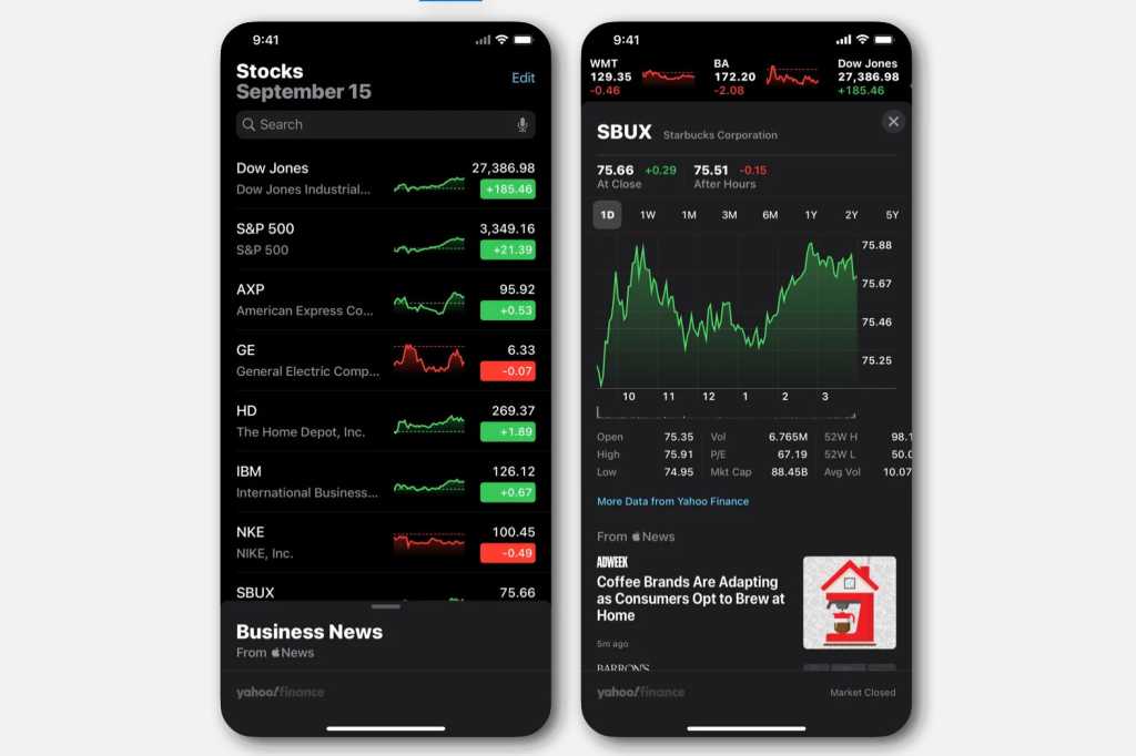
The Stocks app may have been useful back in the days when you had to call your broker to make trades, but smartphone trading is the hot thing now. Manually adding stock symbols just to get data you can’t really act on feels like a waste.
Apple
Apple should allow financial apps like Robinhood, E*Trade, or TD Ameritrade to integrate with Apple’s Stocks app through an API, so your Stocks are always up to date with your accounts. And if you want to make a trade, the Stocks app could deep-link to that exact stock within a supported app. With those changes, we might actually open it sometimes.
Default apps
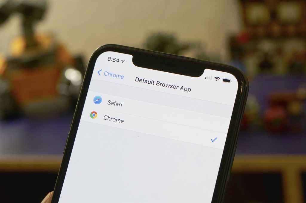
With iOS 14, Apple made it possible to choose a different web browser or email app as your default, so clicking on links and sending mail automatically opens the app you choose instead of always Safari or Mail.
A later update taught Siri to ask which audio app you want to use when asking it to play a song, artist, album, or podcast. That’s not exactly the same thing (you can’t go into settings and change defaults), it’s a start. Just go ahead and let us choose real defaults, already.
There’s no reason for Apple not to go much further with this. Forcing Apple Maps on people when you ask for directions or tap on an address is protectionism that benefits Apple, not its customers.
IDG
Why not let us assign a default Camera app? There are lots of good choices on the App Store, but the camera button on the lock screen always goes just to Apple’s, and asking Siri to take a picture does the same. Messaging, too, should get the default app treatment. In some parts of the world, WeChat is everything, and the fact that Apple always wants to use Messages must be a constant frustration.
Siri (again)
Last year, we noted that, while Apple makes continual improvements to Siri, it has a long way to go measure up to Google Assistant or Alexa. We wrote this about my hopes for Siri in iOS 13:
Siri still lags way behind Google Assistant and Alexa in its ability to answer general questions and gracefully perform actions with third-party hardware and services. There are so many obvious shortfalls; you can do a Spotlight search for a flight number and get detailed flight info, but ask Siri and you just get a web search.
Siri needs better voice recognition, faster response times, and more “fun” activities like trivia and games. It needs to give more accurate answers to a much broader set of questions.
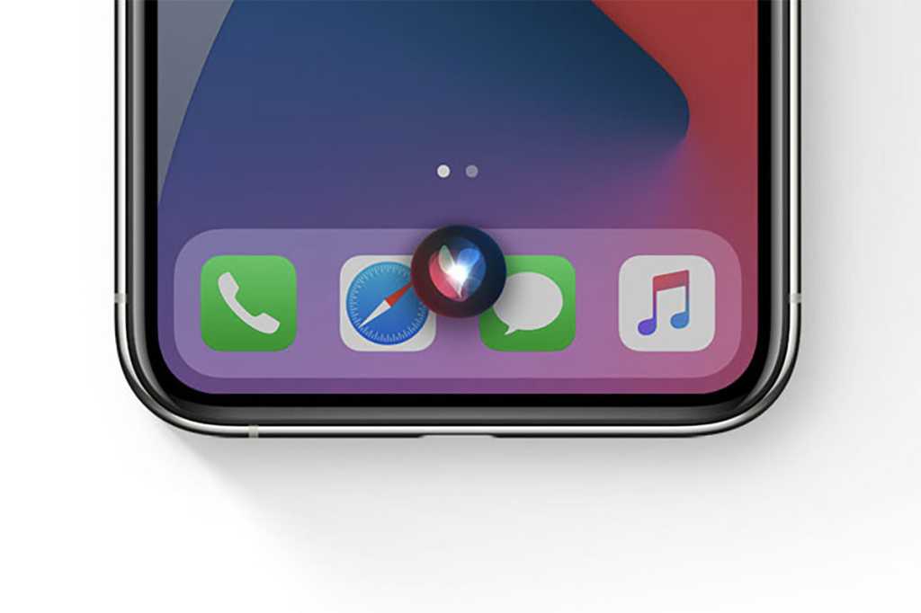
Two years on, all of that is still true. Siri still fails at pretty basic stuff that it should be able to do such as flight status, and the ability to link together commands without having to say “Hey Siri” every time should have been added years ago. Why can’t I tell Siri to stop or snooze an alarm that’s going off? And it’s absolutely absurd that Siri requires a network connection to do anything at all. For a privacy-focused company like Apple, local tasks like setting timers or reminders should work entirely offline.
Apple
Apple tried to make it sound as if Siri got a big boost in iOS 14 by saying it knows 20 times the number of facts…as it knew three years ago. I’m sorry, but 20 times the number of facts as in the iOS 11 days is not the bar Apple needs to clear. That figure should be two orders of magnitude higher! Apple likes to tout its 25 billion Siri requests a month as an impressive figure, but it’s just a big number that sounds impressive. There are over 1.65 billion Apple devices in active use in the world. That works out to a pitiful 15 requests per device per month. On average, users are making Siri requests on each of their devices only about once every other day!
Security and privacy
App tracking transparency
Last year we asked Apple to make reliability and performance the core pillars of iOS 14, and iOS 14 release was remarkably solid. Naturally, no operating system being deployed to hundreds of millions of users using five years’ worth of iPhone hardware is going to be bulletproof, but Apple gets high marks for iOS 14’s reliability.
What surprised us most was the big push into privacy features. From app tracking transparency to clamping down on hidden clipboard, microphone, and camera access, and even “privacy labels” in the App Store, Apple seems fed up with the privacy abuse that’s so rampant in smartphone apps.

IDG
Privacy protection is Apple’s big advantage right now, and I’d love to see iOS 15 push even further to thwart the unnecessary and greedy gobbling up of personal data. Your average user doesn’t have the faintest clue how much personally identifiable information is being collected on them, and they’d be up in arms if they did. Apple took a big step with app tracking transparency in iOS 14.5, but this is a war Apple would do well to escalate.
2FA app integration
With iOS 14, Apple added an awesome ability to take two-factor authentication codes sent via SMS and paste them into the proper request field with just a tap. It’s a huge improvement in usability compared to jumping back and forth between Messages and the app or site you’re trying to access.
But SMS isn’t really the best 2FA method—one-time use codes generated by a code app are far more secure. Apple should build a secure API that allows apps like Authy, Google Authenticator, or Microsoft Authenticator to automatically fill 2FA request fields. It could work just like the SMS auto-fill does, only with one-time use code generation apps.
I have written professionally about technology for my entire adult professional life – over 20 years. I like to figure out how complicated technology works and explain it in a way anyone can understand.
[ad_2]
Source link


