7 Android 12 features Apple should borrow for iOS 15
[ad_1]
With WWDC just around the corner, we’re all eagerly awaiting the new tweaks, features, and settings that Apple is planning for iOS 15. But before the big day arrives, we’ve been checking out the preview release of Android 12 and have come across a few features we’d like to see Apple bring over to the iPhone. Here are seven Android 12 features that we’d love to see in iOS 15.
Notification history
Notifications can be a nuisance, but sometimes we absentmindedly dismiss an alert that we actually need. Once that happens on our iPhone, we’re out of luck. But Android 12 lets you see your recently deleted notifications and we’d love to get that same functionality in iOS.
You can easily access previously deleted notifications in Android 12.
IDG
To be fair, Google actually introduced notification history with Android 11, but its user-accessibility improved in Android 12. You previously had to dive into settings to find the toggle to display your older notifications; Google now has a button right at the bottom of the shade. Tap it and you’ll jump right to the page where you can see everything that was deleted within the past 24 hours.
Apple’s iOS 14 widgets have changed the way we use the iPhone, but there’s one widget missing: Messages. For whatever reason, Apple doesn’t offer a widget for keeping track of iMessage conversations, missed phone calls, emails, etc. We’re not totally sure how this will be implemented into Android 12, but Google has a System UI Conversation widget that lets you see your various messaging apps and offers shortcuts to quickly continue conversations. That would be handy on the iPhone, too.
Quicker settings
Apple’s Control Center is a great way to quickly access settings for Bluetooth, Wi-Fi, Brightness, and other things you need to adjust. But it’s still not as intuitive as it could be. We still regularly pull down the Notification Center when we want to access the Control Center and we can’t help but wish there was one unified place to quickly access everything we need.

Android’s Notification Shade has always made it easier than iOS to access settings, but Android 12 has the best implementation yet. When you pull down on the screen to access your notifications, you’ll get four large customizable buttons for commonly used settings, and if you pull a little lower you’ll get an easy-to-adjust brightness slider. It’s all designed to get you in and out as quickly as possible and makes Apple’s method seem downright stale. It’s long overdue for Apple to combine the Notification and Control Center, and Android 12 might have just perfected it.
Better lock screen
To put it mildly, Apple’s iPhone Lock Screen leaves much to be desired. There are rumors that Apple is planning some changes for iOS 15, and we hope the concept is similar to Google’s method in Android 12. It’s not just the minimal good looks—the lock screen in Android 12 is smarter and more intuitive than before, splitting the difference between the home screen and the always-on display to offer one-look access to the apps and information you need. For example, the clock changes size depending on if you have unread notifications so you can quickly tell if you have unread alerts. It’s small things like that we expect from Apple and want to see in iOS 15.
Colorful modes
Dark Mode is cool but Android 12 takes it a step further. Instead of white and black, Android 12 has a custom color palette that changes the system elements based on the wallpaper you use. Called “color extraction,” the system automatically determines which colors in your wallpaper are dominant and which ones are complementary and adjusts the accents and buttons across your Home Screen and apps accordingly. It makes your phone feel more personal than just making it go from light to dark.
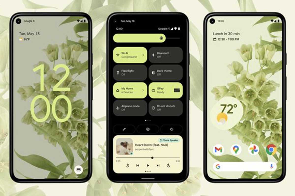
Android 12’s system colors dynamically change to match the wallpaper.
Easier privacy
Google will forever be playing catchup to iOS’s awesome and powerful privacy settings, but Android 12 introduces a couple of features that aren’t just straight follows of Apple’s lead. First, it adds a pair of buttons to instantly disable access to the microphone or the camera for every app that has previously been allowed. To accomplish the same thing in iOS 14, you’d need to go to the Privacy settings and turn off every toggle in the Microphone and Camera tabs.
More importantly, there’s a new Privacy Dashboard that offers a bird’s-eye view of what data and sensors are being accessed by which apps so you can easily revoke any that might be suspicious. You’ll also be able to assign an “approximate location” if you want to keep your precise location private for weather and other apps that only need general location data. Apple has been killing it when it comes to privacy, but Google might have them beat here.
Smarter animations
With a powerful processor and incredible display, iOS animations are a seamless extension of the hardware they run on. But on Android 12 and the Pixel, it truly feels like the software and hardware are aware of each other, with smooth, intuitive animations that respond to touches and swipes as if the phone and software were one cohesive unit.
Use the power button to unlock and the phone will gradually light, starting from the right side. Tap a circular button and it turns square. Plug it in and a pulsing ring of lights ripples across the screen. We love the animations in iOS, but we’d also like to see Apple give them a little more pizzazz in iOS 15.
Michael Simon has been covering Apple since the iPod was the iWalk. His obsession with technology goes back to his first PC—the IBM Thinkpad with the lift-up keyboard for swapping out the drive. He’s still waiting for that to come back in style tbh.
[ad_2]
Source link


