The new iPadOS 15 Home Screen still falls frustratingly short
[ad_1]
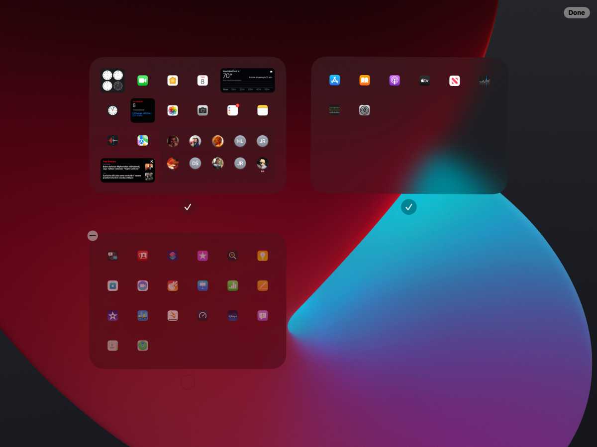
At WWDC20, when Apple showed off widgets and the App Library in iOS 14, my first reaction was, “This would be better on the iPad.” At WWDC21, when Apple showed off widgets and the App Library in iPadOS 15, my first reaction was, “This should be better on the iPad.”
The concept is good. In iPadOS 15, Apple is giving iPad users the ability to remove Home Screen pages and organize their apps into “helpful categories” that are only visible when you need them to be. It makes the iPad Home Screen feel a bit more like a desktop—especially when you hide the other Home Screens—and lets you find apps and locate icons much quicker and more easily.
Apple
With a handy icon in the dock, it feels a lot like Launchpad on the Mac with one shortcoming—you can’t customize it. On the Mac, you’re able to move icons around and create folders to create a personalized space, but on the iPad, it’s the same as it is on the iPhone. Apple’s machine learning engine automatically slides apps into folders based on use and there’s no way to change anything.
Granted, Apple’s algorithm does a pretty good job, but it still feels very static and rigid. Like the Mac, the iPad is more of a productivity device than the iPhone, and not knowing where an app will land each time you launch the App Library is a limitation that slows down your workflow. It’s the same as it is on the iPhone, but where it’s a mere annoyance there, it’s a downright hindrance on the iPad.
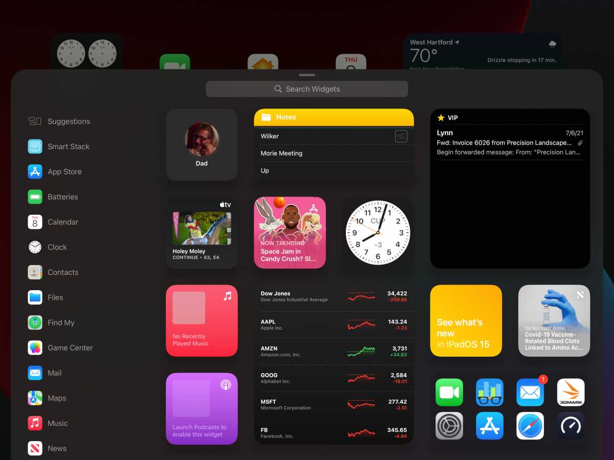
Another iOS 14 feature that made it to the iPad a year late—for reasons I don’t quite understand—is proper Home Screen widgets. Apple has brought all of the widgets from iOS plus a few larger ones available only on the iPad, and they look and act just like iPhone widgets, sliding in between the icons on the Home Screen without disrupting the existing grid. Widgets in iPadOS 15 are supposed to do the same for the iPad that they did for the iPhone, but it doesn’t feel quite right. Widgets follow a similar concept to iOS but aren’t nearly as natural.
On the iPhone Home Screen, widgets elevate the experience and blend seamlessly with the existing icon grid. Icons and widgets are the same height and they all fit well together. Small widgets look great alongside large ones, icons fill in the gaps nicely, and it all flows perfectly.

Apple
On the iPad, widgets look off. Since there’s more vertical and horizontal space around the widgets, they look like they’re floating between the grid rather than part of it. It feels like two systems running side by side rather than in unison. While it’s an improvement over the previous method, which moved widgets out of the Notification Center and onto the Home Screen in a somewhat slipshod way, widgets somehow still look out of place. In iOS 14, the Today screen was basically plopped onto the left side of the first Home Screen in a scrollable column of iOS-style widgets, but in iPadOS 15 they’re more integrated but still not really part of the whole.
You can see it in Apple’s preview images. I wondered why Apple’s iPadOS 15 screenshots showed widgets at the top of the screen and icons at the bottom, and it’s clearly because that’s how they look best. But even if you follow that example, it still doesn’t feel like a fluid Home Screen. Widgets are simultaneously cramped and scattered, and even the large-format ones, which take up four columns and two rows and are quite big, are mere extensions of the iPhone version rather than iPad-specific versions. There’s too much space, not enough information, and feel like a missed opportunity.

Apple
While the App Library and Home Screen widgets bring the iPad a little closer to the Mac, it’s still frustratingly tied to iOS in far too many ways. I wanted a new iPadOS Home Screen experience that took the iOS 14 concept and reimagined it for a larger screen. Instead, I got iPhone widgets on the iPad.
Some of the issues have to do with the unique nature of the iPad’s display. Unlike the iPhone and Mac, it needs to fluidly switch between portrait and landscape modes, and Apple handles that well in iPadOS 15. But that’s also something of an excuse for letting the iPad Home Screen stagnate. Waiting a year for the same widgets and App Library on the iPhone is a letdown, and there’s nothing transformative or transcendent about using it.
Even setting aside the iPad Pro’s M1 processor and XDR display, Apple’s tablet has a ton of untapped potential that’s been an update away from greatness for far too many years. iPadOS 15 brought some of the pieces we’ve been missing. Not we just need iPadOS 16 to put them in the right places.
Michael Simon has been covering Apple since the iPod was the iWalk. His obsession with technology goes back to his first PC—the IBM Thinkpad with the lift-up keyboard for swapping out the drive. He’s still waiting for that to come back in style tbh.
[ad_2]
Source link


