The MacBook Pro’s notch will probably be in the way, but you can fix it
[ad_1]
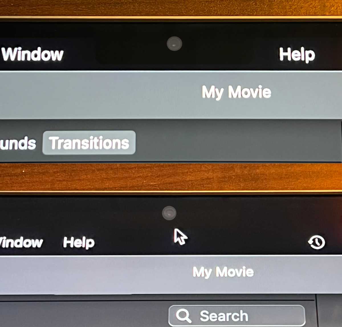
With the 14- and 16-inch MacBook Pro, Apple took a note from the iPhone and added a notch at the top of the display that houses the FaceTime camera. Also like the iPhone, Apple decided to fill the space around the notch with the menu bar.
For most people, it won’t be an issue. However, if you’re the kind of person who uses a lot of menu bar icons or runs their screen at a larger resolution, you might run into visual quirks with the notch that you won’t find on the iPhone. Since the macOS menu bar is much more customizable and versatile than the iPhone’s status bar, some apps could cause issues that others don’t.
So Apple has provided a fix of sorts. When you’re in full-screen mode, you have the option to display the menu bar under the notch with a black strip around the notch. This is handy if the app you’re using isn’t displaying the menu properly while in full-screen mode.
To activate this, click on an app’s icon in the Finder and Get Info on it (Command+I on your keyboard, or go to File > Get Info). If it’s available, you’ll find an option in the General section to “Scale to fit below built-in camera.” Check that box, close Get Info, and then when you launch the app and go into full-screen mode, the menu bar will be positioned under the notch.
IDG
According to Apple’s Developer Documentation for User Interface, this setting shows up if a developer doesn’t write their software to switch on its own. If a developer decides to write their software to use the mode they deem best for their app, the option is not available. Some of the apps that we found with this option so far include Final Cut Pro, Logic Pro, Xcode, iMovie, GarageBand, the iWork apps, Adobe Premiere Pro 2021, Affinity Photo, Civilization VI, Cisco Webex Meetings, Spitfire Audio, and Cinema 4D. It’s entirely possible that those apps and others will be updated by their developers to use a preferred mode.
As noted in our full review of the 14-inch M1 Pro MacBook Pro, the notch doesn’t infringe on the MacBook Pro’s screen area. The screen below the notch is a 16-by-10 space, and the notch and screen on each side of it are “extra” space. When the menu bar is placed in that notch area, it’s actually giving you more room to work with.

Top: By default, the menu bar runs through the notch. If menu listings run into the notch, the menus continue after the gap. Bottom: WIth “Scale to fit below built-in camera” the menu bar is below the notch. (Note: iMovie in this photo is in full-screen mode. Also, the camera has been enhanced to make it more visible.)
IDG
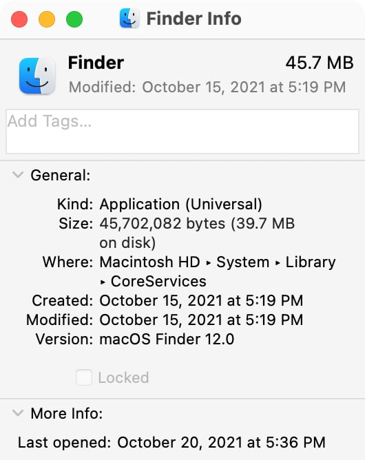
In case you’re wondering, this option is not available for the macOS Monterey Finder, which is basically an app that runs in full-screen mode all the time. So you can’t block out the notch by default, at least for now.

No “Scale to fit” option here.
IDG
As far as menu bar items, Apple will only allow them to fill the right side of the notch, and will only show what can fit: “When menu bar space is constrained, the system prioritizes the display of menu bar menus, as well as essential menu bar extras, such as Clock. To ensure that menus remain readable, the system may decrease the space between the titles, truncating them if necessary.”
Roman has covered technology since the early 1990s. His career started at MacUser, and he’s worked for MacAddict, Mac|Life, and TechTV.
[ad_2]
Source link


