iOS 18: 5 delightful little features that didn’t make the WWDC keynote

It happens every year. Apple announces a new version of iOS with a bunch of really big new features, and then September rolls around, you install the new version, and it’s not the big things you love. Instead, there’s some tiny little quality-of-life improvement that just makes your day-to-day iPhone use so much better.
Over the course of the summer and leading up to iOS 18’s release in September, beta testers will probably find dozens of these little tweaks. Some will appear and then go away, others will change over the course of the beta tests, and some won’t appear until shortly before release in the fall.
But we’ve been keeping our eye on the community, and here are some of the little iOS 18 changes that didn’t make it into Apple’s big WWDC presentation, but we think are worth knowing about.
Flexible charge limits for iPhone 15
If you have an iPhone 15 or 15 Pro, you can force a charge limit of 80%, which is probably very good for the longevity of your battery.
But iOS 18 changes that toggle to a slider with settings for 80, 85, 90, 95, and 100 percent, taking one of our favorite features and making it better because we’re all about limiting charging for battery life but giving up 20% of our battery to do it was just a little too steep a price.
A setting of 85 percent or 90 percent would likely have a lot of benefits without feeling like your phone is going to run out of charge.
Improved Apple Music queue
Apple Music users have been complaining about its interface for as long as it has been around, but Apple has been making welcome changes, bit by bit, and now it’s quite good. But even Apple Music fans have complained about the Queue or “Up Next” interface.
It’s a lot better now, with a refreshed look and better interactions. For example, “Play later” now puts a song a the end of your queue not at the end of your entire music selection, and the queue no longer clears when you tap to play another song.
For some, this really fixes one of the last big pain points with Apple Music.
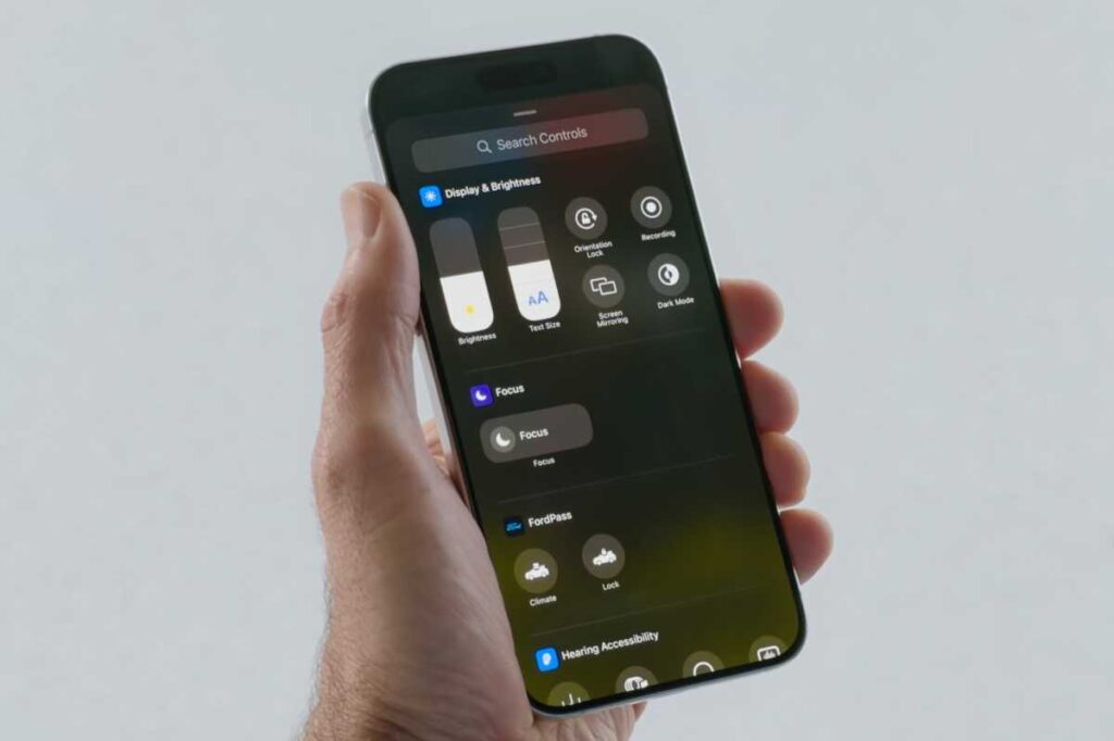
The new Control Center in iOS 18 has a surprise flashlight feature.
Apple
New flashlight interface with beam control
There’s a new flashlight interface–a small “card” with a flashlight image near the top of the display.
Frankly, it’s a little too small, but it looks nice and it has a cool new feature. In addition to adjusting brightness (which seems to maybe go brighter than before), you can adjust beam width if you have an iPhone with Adaptive True Tone Flash.
That means anyone with an iPhone 14 Pro or iPhone 15 Pro can set the flashlight beam to one of three different widths. Neat!
Another way to power off your iPhone
Have you ever tried to explain to someone who isn’t very technically savvy about how to turn their iPhone off? Not put it to sleep, but actually power it down? With iOS 18 there’s another way to do it. The Control Center has a clear power button in the upper-right corner. Tap that and you go to the “Slide to Power Off” screen.
It may not be easier for everyone—for some reason, a lot of users seem completely unaware of the existence of the Control Center or how to make it appear—but it’s at least a visual interface element and an obvious one. The “semi-circle and line” power symbol is essentially universal at this point.
New Calendar month view
The Calendar app has a few new interface tweaks but none are as useful, and attractive, as the new monthly calendar view. Instead of showing a full month of days with a smattering of rather unhelpful event dots, prompting you to switch to the day or week view to see what it is, you can see see actual events on the days.
What’s more, pinching to zoom stretches the days taller or shorter, to show more or less on each day. You can go all the way back down to color-coded dots and lines and up to show six or more events with labels.
iOS


