A brief history of Mac system fonts

Last weekend’s Mac Riddles dipped gently into the topic of Mac system fonts, something Apple has always devoted great attention to. This article explains a little more of their history. Further details of that are in Wikipedia.
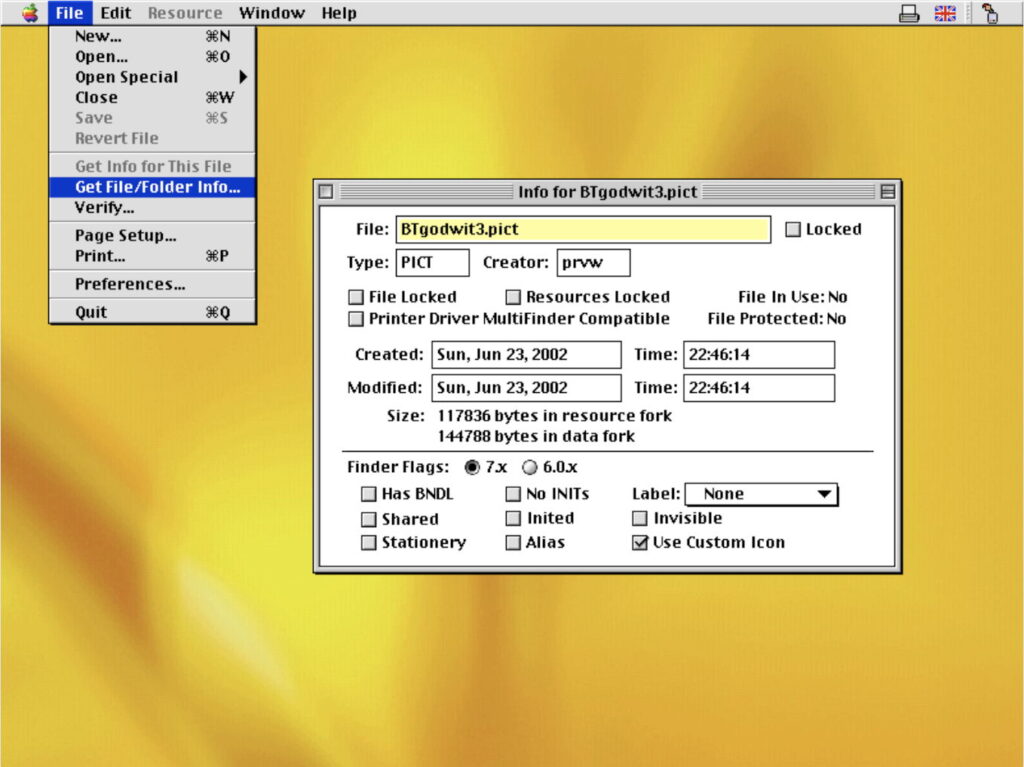
When first introduced, the Macintosh used Chicago, a bitmap font designed in-house by Susan Kare, but that was improved with System 8 in 1997, when it was replaced by Charcoal, designed by David Berlow, shown below.
By this time, Mac OS was transitioning away from bitmap fonts, with the release of TrueType in System 7. In 1999-2000, Apple switched again, this time to Lucida Grande, which remained the standard until 2014, although Chicago was revived for the first iPods.
Lucida Grande was designed by Charles Bigelow and Kris Holmes, and supported the most common characters of the Unicode 2.0 standard. The Bigelow & Holmes foundry had started developing fonts in their Lucida family in 1984, aiming for clarity, hence the name derived from lucid, as shown in the example below.
For iPhones from 2010, Apple used Helvetica Neue, and that was adopted by OS X 10.10 Yosemite in 2014, making it standard across all Apple’s products.
Helvetica Neue had been designed in 1983 by a team at D. Stempel AG, part of the Linotype group, as a derivative of Max Miedinger’s Helvetica from 1957. Both families of fonts have become among the most popular sans-serif typefaces, and remain in widespread use. Their name is derived from Max Miedinger’s Swiss nationality.
With the release of OS X 10.11 El Capitan, all Macs and devices came with San Francisco, abbreviated to SF and SF Pro.
San Francisco was designed by Apple from the outset to be its house font. However, Apple restricts its use to developers in products for its own platforms, and it isn’t made available for general use. Accompanying it is SF Symbols, a library of vector-graphics icons and symbols, with a similarly restrictive licence, most of which can be used in apps for Macs and Apple’s devices.
