Darkness reigns over Wikipedia as official dark mode comes to pass

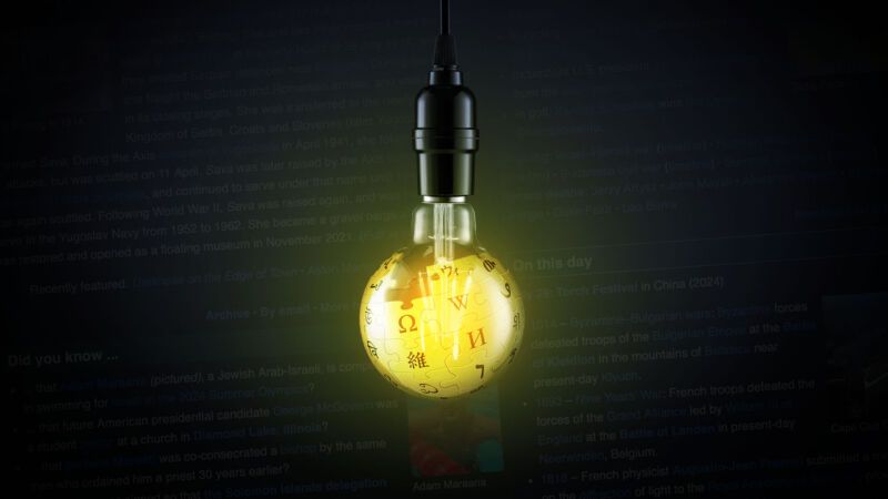
Enlarge / Wikipedia’s decades of content can be a light to you in dark places, and now you can choose the dark for yourself. (credit: Aurich Lawson | Getty Images | Wikipedia)
Dark mode, night mode, light-on-dark design, or whatever you want to call the version of computer content that doesn’t feel blindingly bright at night, had something of a peak moment around 2019–2020. That’s when Android and iOS designed a system-wide way to implement a darker theme, and signal to compatible apps to do the same. Many, many systems, apps, websites, and other digital tools soon followed.
Except, most notably, Wikipedia. Despite being one of the sites most sympathetic to late-night mind wandering, Wikipedia had no official way to switch its iconic white pages into something more sleep and eyeball-friendly. Now, after great effort from its community, a dark mode (technically a dark “Color” setting) is available to most Wikipedia visitors on both desktop and mobile.
On desktop, look for a sidebar on the right-hand side that has buttons for setting text size and width, and then “Color (beta).” If you don’t see a sidebar, look for an eyeglasses-like icon in the upper-right corner near the search and account tools. On mobile, look for the three horizontal bars (aka hamburger button) in the upper-left corner of a page, choose Settings, then pick your Color. There is the standard Light you know, Dark, and Automatic, which takes its color cues from your system.


