Sleek Apple hardware is stunning, but sometimes it’s hard to beat a button

Remember Gil Amelio? He was the cursed stock photo of a middle manager in a suit that ran Apple for a short while before bringing Steve Jobs back and then being eaten alive by him. In one of his many awkward appearances as Apple CEO, he once said he wanted to make the Mac like a Maglite: simple, utilitarian, useful. 28 years later, could that little bit of Amelio wisdom finally be having its day?
Apple’s new hardware tends to get the big headlines. But what I’m here for right now is how the company is making its existing products easier to use with hardware features.
Design is how you use it
For years Apple has built a reputation for minimizing. Under Jony Ive’s baleful gaze (have you ever seen his Apple executive mugshot?), the company made laptops so thin the keyboards came with an expiration date. Thinness and beauty are great goals, they should just not be striven for at the exclusion of all else.
It’s no secret that Apple has been walking back that mindset in the years since the MacBook Pro with TouchBar. Today’s MacBook Pros have more ports and better keyboards. And yesterday’s MacBook Pro users have some of their money back, thanks to a class action lawsuit against the company. Apple learned the hard way that it’s great if your products look amazing, but they also have to work right.
Was the rebirth of ports on the MacBook Pro the realization by Apple that sometimes more is more?
Thiago Trevisan
Any port in a storm
You can give people ports without keeping floppy drives, VGA ports and SCSI connectors. Give people the ports that make sense right now. Or, better yet, a year from now. Skate to where the hockey puck mouse is going.
The Mac Studio proves that you can put ports on the front of a Mac and still have a device that looks great. If the current rumors are to be believed, even the upcoming diminutive redesign of the Mac mini will feature USB ports on the front. Imagine a device with ports on the front in a size that would force a smile onto even Jony Ive’s stony face, something made possibly by getting rid of the USB A connector. Just the ports you need, just where you need them.
It might be considered heresy but you could even… dare I say it… put ports on the front of the iMac, too. Too much? Okay, how about the bottom?
The point is, Apple can make devices that still look great but are just easier to use. In fact, it did that just this week.
There was a time in Apple design philosophy where the idea of ports on the front of a Mac was blasphemous.
Wachiwit / shutterstock.com
I see you shutter with antici-pation
When the iPhone was first announced, it famously had one button–okay, one button on the face. It also had a power button on top, a volume lever, and a mute switch. Want to feel old? Of course you don’t, who does? But that was 17 years ago.
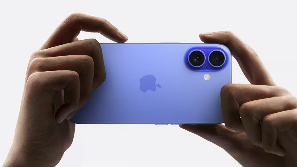
Apple did away with the button on the face without losing any functionality, so it can afford to add one back. On Monday, Apple unveiled the Camera Control button on the iPhone 16 line, a hardware feature that makes it easy to quickly do the one thing that people want to do with the phones the fastest.
We haven’t had the chance to dive deep with the upcoming Camera Control button on the iPhone 16, but it certainly makes sense.
Apple
Not answering phone calls. What kind of monster wants to do that faster? No, when you’re quickly fumbling for your iPhone, you want to take a picture. For years Apple has tried to make it easier to quickly take a picture by adding software features, but a lot of us (and, yes, I mean me) get hung up in the moment. Swipe left? Tap and hold the camera icon on the lock screen? Scream and swipe up and search for the camera app? Whoops, too late. The dog has stopped being cute, your kid has grown up and gone to college.
As Jason Snell opines, the Camera Control button:
…is Apple realizing that people don’t, and won’t [use iOS’s software affordances for quickly taking pictures], and trying to give them a safe, dedicated place for all their photography.
Add a button, add utility.
There are limits, of course. A cup holder has utility, too, but you wouldn’t want one on your iPhone. A headphone jack likewise has utility, but AirPods have more.
Still, while software is great, it can’t make up for everything. Sometimes you just need a button, or a port in a convenient place.
More like this, please
Ever since the original iMac dropped the floppy drive, Apple has had a reputation for savagely removing things. Sometimes removing things truly makes products better. No one would look back on the Bondi blue iMac now and shake their head and say “It shoulda had a floppy drive.” But when you get down to the base of a product, you can also see what it truly needs to make it easier to use. A lot of times, that’s a physical thing. As Apple does this to more products, it’s got me more excited than a sack full of Vision Pros.


