iOS 18’s new home screen features are a long-awaited win for flexibility

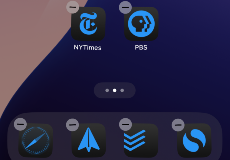
Enlarge / iOS 18’s home screen color tinting and grid-based app icons in action. (credit: Samuel Axon)
Apart from the much-ballyhooed (and delayed) Apple Intelligence, a big change to home screen customization and app icon placement is one of iOS 18’s flagship features, alongside an overhauled Control Center.
With the public launch of iOS 18 this week, we’ll be delving into those flagship features one by one, and I’m starting with the home screen because I have often criticized the iPhone’s home screen experience in the past. iOS 18 promises the biggest update to home screen customization since, well, ever.
Let’s walk through how to use the new features, explore how they work, and try to answer the most important question: does the iPhone finally offer the kind of home screen flexibility that users have been asking for?


