Last Week on My Mac: Lost for words in System Settings
Writing a coherent and comprehensive description of a painting is an excellent exercise not only for writing skills, but to remind yourself of the adage that a picture is worth a thousand words. Nowhere is this more appropriate than when describing graphical user interfaces such as macOS, as I reminded myself this week when trying to sort out a problem with Desktop behaviour.
That took me to Sequoia’s revised System Settings, where those for Desktop & Dock have become a farrago covering anything from the default web browser to the addition of margins to tiled windows. Although I’ve been one of System Settings’ few advocates, that section has become an example of what they shouldn’t be.
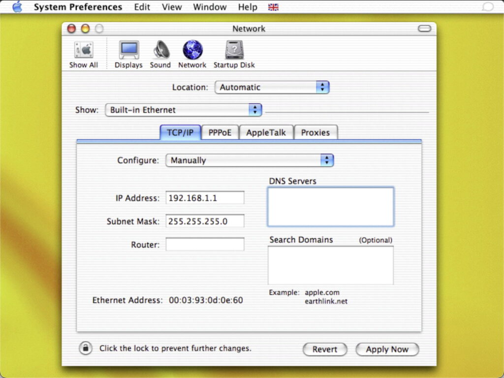
After the Finder, tools for configuring the appearance and behaviour of the interface are the most important. For many years, we had to do this through the keyhole of the fixed window size provided by System Preferences.
Many of its more complex panes had to resort to multiple tabs, here in the Network pane of 2002.
This was no easier for relatively simple panes, such as Sound, seen here in macOS 12 nearly 20 years later.
Ventura’s completely reworked System Settings were controversial, but at last provided the ability to expand panes vertically, although at that time many used floating windows to arrange discrete groups of settings in a hierarchy, such as those for Stage Manager.
Some of those used pictures, although most were illustrative rather than replacements for a thousand words, unlike the screenshot below.
Sequoia’s Desktop & Dock settings have been flattened out into a single view that’s so deep it even has to be scrolled on a Studio Display. Its sections include the Dock, Desktop, Stage Manager, Widgets, default web browser, Windows, tiling, Mission Control, keyboard shortcuts and Hot Corners, while further settings for the Desktop are controlled in Appearance and Wallpaper. Many of these are obscure unless you already use a feature, and many need further help, even for those who have been using macOS for years.
Like Desktop & Dock settings, its help page uses words exclusively rather than pictures, often doing little more than paraphrasing the text labels already shown in System Settings. Apple Support is one of many to provide a video tutorial for these settings, but those are of limited benefit when you just want to check how the options available for tabs in windows affect the appearance and behaviour of document windows, for example. Yet that would be so simple to demonstrate in three cutouts from screenshots, and so much more meaningful than the paraphrasing in Help: “Choose when you want documents to open in a tab (instead of in a new window): Never, Always or In Full Screen.”
In the last few years, Apple has devoted considerable engineering effort into enriching the macOS human interface, with Stage Manager and most recently Sequoia’s tiling feature. Even though you may not wish to use either, they do have their uses and some find them powerful.
Tiling is a case in point, as Apple seems to have decided that it should be enabled by default when you upgrade to Sequoia. That results in frustratingly changed behaviour when you drag a small window up to the top or another edge of the display, and it suddenly tiles out to cover the whole screen, without offering any Undo. Only by rummaging through System Settings will you discover that you can return that to normal by turning off Tile by dragging windows to screen edges in Desktop & Dock settings, although this has nothing to do with the Desktop or Dock.
In principle, I still believe System Settings is the right way forward, with its vertical flexibility and use of SwiftUI. But leading designs using those now come from third-party developers. It’s time for Apple to reassert its former mastery of the human interface, and realise the potential of SwiftUI by making System Settings a paragon rather than a pickle.