Reading Visual Art: 205 Colour codes A
The use of colour to add meaning to images is longstanding practice, and can be traced back to ancient Egyptians, who tended to use it to distinguish males from females. Most probably the result of their belief system, females were often depicted with paler or even white skin, while men were more swarthy in appearance.
Artist not known, Funeral Procession, Tomb of Ramose (c 1353–1336 BCE), fresco original copied in tempera on paper by Nina de Garis Davies (1881-1965), 81 x 574.5 cm, Metropolitan Museum of Art, New York, NY. Wikimedia Commons.
In this fresco of a funeral procession from the tomb of Ramose, dating from about 1353–1336 BCE, there’s a clear distinction in skin colour between the central group of women, and the men on the left and right.
This passed through into the Renaissance.
Maerten van Heemskerck (1498-1574), Adam and Eve (detail) (c 1550), oil on wood, 177 x 50 cm, Musée des Beaux-Arts de Strasbourg, Strasbourg, France. Image by Ji-Elle, via Wikimedia Commons.
This can be most apparent in paintings of Adam and Eve, here that made by Maerten van Heemskerck in about 1550, where Eve is as white as ivory.
Annibale Carracci (1560–1609), Latona and the Lycian Peasants (date not known), oil on canvas, 90.6 x 78 cm, Arcidiecézní muzeum Kroměříž, Olomouc Museum of Art, Kroměříž, The Czech Republic. Wikimedia Commons.
Annibale Carracci’s Latona and the Lycian Peasants, probably from 1590-1620, shows the near-white goddess Latona placing her curse on the swarthy-skinned locals.
After the Renaissance, this colour-coding largely disappeared, only to return at the end of the nineteenth century.
Evelyn De Morgan (1855–1919), Boreas and Oreithyia (c 1896), oil on canvas, dimensions not known, De Morgan Centre, London. Wikimedia Commons.
Evelyn De Morgan’s Boreas and Orithyia from about 1896 shows the darker Boreas, the north wind, bearing the paler Athenian princess Orithyia aloft.
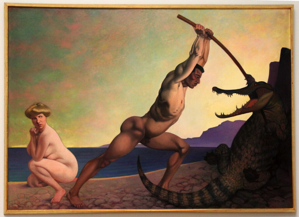
Félix Edouard Vallotton (1865-1925), Perseus Killing the Dragon (1910), oil on canvas, 160 x 233 cm, Musée d’art et d’histoire de Genève, Geneva. By Codex, via Wikimedia Commons.
In the early twentieth century, the former Nabi artist Félix Edouard Vallotton painted a series of narrative works, including his Perseus Killing the Dragon, from 1910, a thoroughly contemporary interpretation with a marked contrast in skin colour. This is most evident where their feet are close together at the lower edge of the painting.
Independent of that coding, paintings of hell and devils developed their own colour schemes.
Giotto di Bondone (c 1266–1337), The Last Judgment (detail) (1306), fresco, dimensions not known, Cappella degli Scrovegni, Padua, Italy. Image © José Luiz Bernardes Ribeiro, via Wikimedia Commons.
This detail from Giotto’s fresco of The Last Judgment in the Scrovegni Chapel in Padua, Italy, was painted in 1306. It follows the early convention that its humanoid demons are colour-coded blue, with some in brown, in contrast to its densely-packed and near-white victims seen undergoing punishment. There’s no colour-based distinction between men and women here, though.
Luca Signorelli (1441–1523), The Damned (1499-1502), fresco, Cappella di San Brizio, Orvieto, Italy. Wikimedia Commons.
Luca Signorelli’s large fresco in the San Brizio Chapel in Orvieto shows the seething mass of The Damned (1499-1502). His colour-coding is richer, and there’s precious little sign of flames, fire, or even rocks, just a dense mass of people being tormented.
Bonifazio Veronese (Bonifacio de’ Pitati) (1487–1553), St Michael Vanquishing the Devil (1530), oil on canvas, dimensions not known, Santi Giovanni e Paolo, San Zanipolo, Venice, Italy. Image by Didier Descouens, via Wikimedia Commons.
Bonifazio Veronese’s St Michael Vanquishing the Devil from 1530 shows a dark-skinned humanoid with draconian wings, which may have descended from older images in which the Devil (with the definite article) is shown as a straight dragon. This artist isn’t the great Paolo Veronese, but a Venetian painter whose work influenced Tintoretto.
Henry Fuseli (1741–1825), The Nightmare (1781), oil on canvas, 101.6 × 127 cm, Detroit Institute of Arts, Detroit, MI. Wikimedia Commons.
This visual distinction extends to more recent paintings, including Henry Fuseli’s The Nightmare from 1781. The daemonic incubus seen squatting on the torso of a young woman is swarthy in colour compared to his victim’s pallor.
Ary Scheffer (1795–1858), The Temptation of Christ (1854), media and dimensions not known, Walker Art Gallery, Liverpool, England. Wikimedia Commons.
Ary Scheffer used clear colour coding in his Temptation of Christ, from 1854, where the fallen angel is trying to get Christ to jump from a pinnacle so that he could rely on angels to break his fall.
Most recently, some have tried to interpret this as racialism, but these codings have older origins, and only appear in skin colour, not overall appearance. It would be nonsense to suggest that any of these devils were intended to represent North Africans, for instance.


