Last Week on My Mac: Fidelity in design
Quick Look is one of those unsung heroes that have transformed our Macs and workflows. What used to require a specialist app can now be accomplished in the Finder using a combination of Quick Look and Gallery view to browse collections of images.
This started back in Classic Mac OS, when apps created thumbnail images and attached them as ICN# resources to the original files for display in the Finder. It wasn’t until Mac OS X 10.5 Leopard in 2007 that Apple added Quick Look to perform this automatically using cached thumbnails and previews. Since then our Macs have worked hard to ensure that, wherever we want them, we can see faithful miniatures, at least until macOS 11 Big Sur.
Although the redesign brought by Big Sur in 2020 was generally well received, one feature I complained about at the time was its effect on Quick Look thumbnails and previews, in rounding their corners to conform to its design style. But style triumphed over fidelity, and for the last five years Quick Look has been forced to tell lies in every image thumbnail and preview.
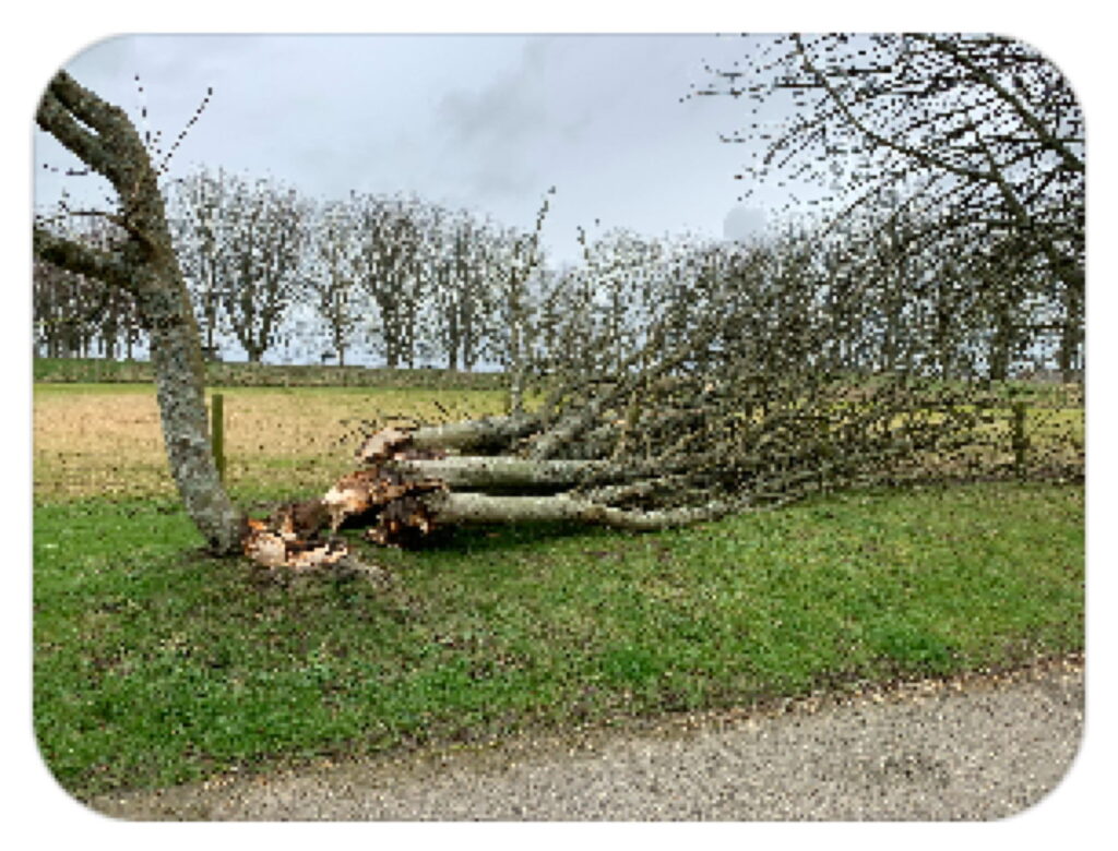
By now you’ll have guessed I’m no fan of Apple’s new-found obsession with rounding every right angle in sight. I have yet to see any objective evidence that this has any purpose beyond aesthetics. If you’ve seen screenshots of the first developer beta-release of macOS 26 Tahoe, then you’ll surely have noticed that, rather than restoring fidelity to Quick Look, this fiction has grown and only become more prominent. I demonstrate this in a series of four screenshots showing the same image that have been rescaled to similar display sizes.
This first is taken from a small, almost thumbnail-size, image in the Finder’s Gallery view. As this has been scaled up, it’s pixellated. I draw your attention to the upper corners, where trees have been cropped at what once would have been right angles.
Seen here is the same image in a larger Gallery view. The extent of the cropping at the upper corners is now apparent, where this contains details that were removed from the smaller image above.
When opened in Preview, the upper corners are no longer rounded, and show the full extent of the image, but the lower corners remain cropped by enforced rounding, apparently to make them ‘concentric’, as is the vogue.
To see the whole image rendered faithfully, I had to resort to a third-party app, here GraphicConverter 12, which has the honesty to display all four corners without cropping.
One of the cornerstones of the Mac from its earliest days is expressed in the principle of WYSIWYG, what you see is what you get. It enabled the ‘desktop publishing revolution’ that convinced so many to pay the premium for Classic Macs, and ever since has guided the development of Mac OS. Without it there would be no purpose to Quick Look in its efforts to render images faithfully.
That doesn’t merit mention in the principles expounded in Apple’s latest revised Human Interface Guidelines. Three are given there, hierarchy, harmony and consistency, but not fidelity. Rounding corners of rectangles is included there under the principle of harmony: “Align with the concentric design of the hardware and software to create harmony between interface elements, system experiences, and devices.”
I can live with concentricity in windows and controls, even with app icons forcibly constrained within rounded rectangles. What I simply can’t accept is a Macintosh, of all computers, cropping every thumbnail and preview for the sake of aesthetics, however harmonious that might seem. For without fidelity, the Mac fails.

