Three upcoming Apple features that matter more than FaceTime and SharePlay
[ad_1]
With Apple’s Worldwide Developers Conference firmly behind us, we’re taking our sweet time picking our way through everything coming to Apple’s platforms this fall. As usual, there were way more changes than Apple talked about onstage, and between watching the conference sessions, scrolling through long webpages of features, and keeping a gimlet eye on Twitter, even more have come to light.
But with such a preponderance of information, it can sometimes be hard to suss out which changes are likely to make a big impact on the lives of Apple users, and which will end up disappearing into the pond without so much as a ripple. Will we still be talking about iPad widgets a year from now? Will everyone have switched to Apple’s new two-factor authentication generator? Some features will have staying power; others won’t.
With that in my mind, here are my bets on which of Apple’s new features will make the biggest difference for its users.
Surfin’ Safari 15
If there’s a contentious move in Apple’s latest suite of improvements, it’s the redesign to the company’s web browser. While I don’t have metrics on hand, I’d be pretty surprised if Safari weren’t the most commonly used program on at least the iPhone and iPad. This means even a meager change is likely to make waves and, as changes go, Safari 15 is anything but meager.
Amongst its most notable updates, Safari 15 redesigns tabs as little rectangles, subsuming them into the window chrome, which now matches the color of whatever webpage you’re viewing. Apple’s stated goal is to get the browser out of the way, but there’s a reasonable question of whether this is a matter of form over function. Several common features—including the refresh button—are now hidden away beneath a single button in the location bar, necessitating an extra click. (Though you can now reload a page by pulling down from the top.) And titles in tabs are often truncated, making it hard to differentiate them, especially if you have multiple pages from the same site open. On the iPhone, the location bar has moved to the bottom, which can obscure some content and even controls.
Apple
Apple’s thought about some of these issues, it’s clear. In the company’s Design for Safari 15 WWDC session, Web Technologies Evangelist Jen Simmons mentions that if Safari detects that the color of your page might negatively affect accessibility, the browser will override and default back to white. And it advises web developers to take the iPhone location bar into account when creating their sites.
But that and other design changes will require a legion of web designers to rework parts of their sites, and with Safari only one browser amongst many—albeit a popular one—that seems like potentially a losing proposition for Apple. It is, of course, possible that further tweaks to the browser may be forthcoming during the beta period that makes these changes more palatable…but it’s just as likely that Apple stands pat.
Never taken a shortcut before?
Automation has long been a part of the Mac, from AppleScript to Automator. But while those technologies have gotten a bit long in the tooth, iOS seems to have somewhat supplanted the automation crown, thanks to Shortcuts. That’s why the addition of Shortcuts to the Mac holds such potential.
It’s not just that automating with Shortcuts is much easier than with Automator, but it’s also potentially much more powerful—thanks to broad support in both Apple’s own apps and third-party programs. Early indications suggest that many iOS shortcuts will easily make the jump to the Mac, and the Shortcuts on the Mac also supports hooking into automation tools like AppleScript and the command line, to the benefit of power users. Interoperability between Apple’s platforms here also makes it likely that future updates to Shortcuts will benefit those who live throughout Apple’s ecosystem.
As someone who has repeatedly tried to automate common tasks on the Mac only to throw up their hands in frustration, Shortcuts’ arrival on the platform lets me hold out hope that I’ll finally be able to create workflows that save me time across all my platforms.
Going splitsies
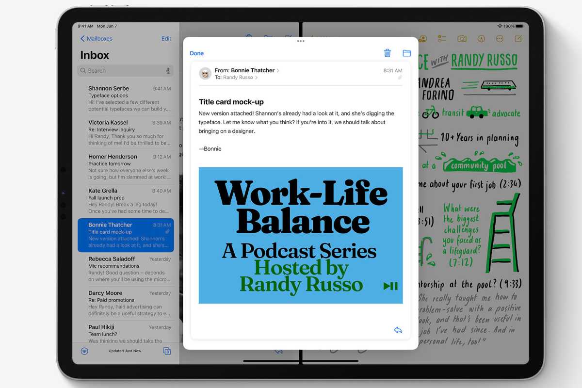
This year marked Apple’s third crack at multitasking on the iPad, and while it may not have been the ground-up rethink that some (including myself) had hoped for, there are promising signs that it will still greatly improve the experience for both power users and more casual consumers.

iPadOS 15 has features to make multiasking easier.
Apple
A big part of that is simply making multitasking more visible. There’s now an explicit icon for windowing, providing controls akin to the ones you find by hovering over the green icon at the top of a Mac window. iPadOS 15 also removes some of the song-and-dance of getting apps into a Split View, letting you drag them in from a Spotlight search or from your home screen, and even if Slide Over remains a somewhat annoying feature, the addition of a floating and resizable window for the new Quick Note feature is evidence that a more powerful windowing system could work on Apple’s tablet.
Simply put, the more people who use multitasking on the iPad, the better it should get, and improved visibility and ease of use are poised to usher a lot more people into a reality of using multiple apps at once—which is a good thing, because it remains one of the iPad’s weaker qualities when compared to a Mac. As for whether Apple will decide to launch itself into a full-fledged windowing system, well, we could be waiting until iPadOS 16, at least.
[ad_2]
Source link


